


Grading companion to Era 7, the Black & White era. Part of the twelve-era timeline. This page quotes no prices and no population figures; it explains the structure that decides whether a submission makes sense.
Quick answer
Full art was born in this era, and it enlarged the area a defect can occupy from a holo window to the whole card face — so from here on surface is the subgrade most often lost, where in every era before it the loss came at the corners and edges. Before this, a card could be described as “clean except the back corners” and still grade well, because most of its face was flat colour that nobody assessed closely. A full art card has almost no flat colour. The foil pattern runs under the artwork, the text and the border alike, and a mark anywhere on it is a mark on an assessed surface.
The change is not in how graders assess. It is in the ratio of assessed surface to buffer, and it moved in one direction in a single release cycle. That is why a submission strategy built on older eras — check the corners, check the centring — underperforms here.
Where the grade dies, era by era
The table compares the four eras covered so far by the thing that most often decides the outcome. Read it as a trend rather than a set of absolutes: every era loses grades to every defect, and the question is which one binds.
| Era | What is assessed as surface | Where the grade usually dies | What the raw pool looks like |
|---|---|---|---|
| Base Set (1996–2001) | The holo window only | Centring, then corners | Large, played, widely stored without sleeves |
| e-Card (2001–2003) | Window, or the whole face on a Crystal | Surface, on the whole-face foil | Thin, lightly played, better centred |
| Diamond & Pearl (2006–2009) | The whole face on LV.X | Rim rubs reaching the image | Mixed, with tin contact marks |
| Black & White (2010–2013) | The whole face on every full art | Surface marks anywhere, including the text block | Mostly pack-fresh, because these were the cards people sleeved immediately |
The last column is the part that changes the decision. In the earlier eras the raw pool was a condition problem — plenty of cards, few clean ones. Here the pool is the opposite: the full arts were the chase cards, so almost every copy went straight into a sleeve, and the survivors are mostly in good condition. Your copy therefore has no condition advantage over anyone else’s, and the things that separate one submission from another become centring and print quality.
Why full art amplifies a surface mark
Three properties of the treatment do the work.
The foil is continuous. On a card with a window, a scratch either lands inside the window and costs, or outside it and costs less. On a full art there is no outside. Every millimetre of the face is the same reflective field, which means the defect is never in a place that carries reduced weight.
The pattern is fine. A full art carries a dense, low-contrast foil texture rather than a broad shimmer, and a scuff interrupts the texture instead of sitting on top of it. The interruption is small and it is legible at a glance, because the eye is good at spotting a break in a regular pattern.
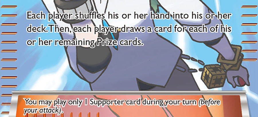
The text sits over the pattern. Full art cards carry their rules text in light type over a busy field — the least forgiving combination available. A scuff through a line of light text on a patterned background reads as damage even when the same scuff on plain stock would read as a smudge.
Five checks before a full art is submitted
- Rake the light across the whole face in one slow pass. Not spot checks. The point of this era is that the defect can be anywhere, so the inspection has to cover the card rather than the places where defects used to be.
- Look at the dark, flat areas first. A scuff lifts a dark field toward white, which is the highest-contrast change available on the card. If there is a mark, that is where it will show.
- Read the text block as a surface. Follow the lines of type with the light at an angle. Any break in a stroke is a surface defect sitting in the most conspicuous place on the card.
- Check the foil pattern for a discontinuity that was printed, not added. A print line runs straight and stays visible at every angle; a scratch appears at one angle and goes at another. Both cost surface, but only one is worth arguing about.
- Check centring last, and check it on the back too. With the surface settled, centring is the remaining variable, and on this era it is often the only thing separating two otherwise identical cards.
What “pack-fresh” is worth as a claim
On this era, “it came out of a pack and went straight into a sleeve” is the normal history rather than a distinction. That has two consequences for a submission decision.
The first is that a good-looking raw full art is not evidence of anything, because most of them look good. The second is that the population of high grades is not a scarcity signal in the way it is on old-back stock: it is a record of how many people submitted, not of how few cards survived in condition. Both of those point the same way — the decision rests on a close inspection of the specific card, not on the class or the story attached to it.
There is a third, subtler consequence. When the median raw copy is already clean, the question stops being “is this card in good condition” and becomes “is this card better than the middle of its own population”. That is a harder question, and it is the one that decides whether the fee produces a number worth having.
Storing cards whose face is the whole card
The physical problem here is grit. A full art card is a large reflective surface held inside a sleeve, and any particle that gets in is pressed against that surface every time the sleeve is handled.
That makes sleeve hygiene the main issue rather than the choice of holder. A matte premium sleeve should be replaced when it has been opened and closed a few times, because the inside picks up fibre and dust that you cannot see and the card does the polishing. Sleeving on a clean surface, with the card supported rather than dropped in, is worth more than any upgrade in holder.
The second issue is pressure. These cards are stored in stacks, and a stack transmits weight through every face in it. A press-fit rigid case distributes that weight across a rigid face rather than across the print, which is the difference between a card that stays flat and one that develops a faint sheen where it was pressed. A rigid 3×4 toploader is adequate for a single card in transit and is the usual choice for a submission, provided the card is sleeved first and not slid in and out repeatedly.
For display, a display slab keeps the face visible and the card still, and on an era whose whole appeal is the treatment of the face, visible is the point. Humidity is the usual background risk and behaves as it does on other laminated stock of this period.
Where this sits
This page follows the LEGEND / HGSS grading page, where the object was two cards, and precedes the XY grading page, where the problem becomes identification: the same artwork exists as an original and as a reprint. This is the hinge page of the sequence, because it is where the assessed area stops being a window. For the card-level story, see Era 7; for the full sequence, the twelve-era timeline.
Frequently asked questions
Are full art cards harder to grade highly than the holos from the same set?
Yes, because more of the card is an assessed surface. The same amount of handling produces a defect that lands somewhere that carries full weight rather than in a margin.
Does a print line count against a full art card?
It does. It is a surface defect present since manufacture, and the fact that it was not the owner’s doing does not change how it reads under a lamp.
Is centring still worth checking on this era?
Yes, and it is often the deciding factor once the surface is clean, because so many copies survived in good condition. Check the back as well; a back offset is common and easy to overlook.
Why are BW full arts usually found in good condition raw?
Because they were the cards people protected. They went from pack to sleeve immediately, which is the opposite of what happened to the era’s common cards.
Does the same advice apply to the later EX cards in this era?
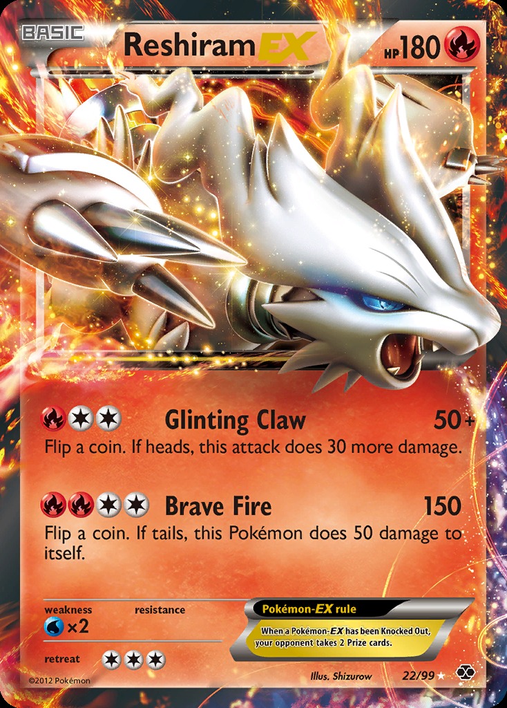
Yes. The full art treatment continues into the era’s EX cards, and the surface logic is the same: a continuous foil field, fine texture, light text over a busy background.
What the cards in this era actually look like
Both cards below carry a foil field across the entire face. The third figure is a detail of the text block, which is where a small scuff costs most.
Sources
Sources and further reading
- The Pokémon Company — the Black & White series, 2010 to 2013.
- The Pokémon Company — the introduction of the full art treatment in this era.
- The Pokémon Company — the later EX cards of the era, which carry the same full-face foil treatment.
- CardSpicy — PSA vs BGS vs CGC, for how surface is weighted against centring and edges.
- CardSpicy — How often to replace card sleeves, for the hygiene point made here.
- CardSpicy — Era 7 — Black & White, 2010 to 2013, for the card-level history this page assumes.
Related reading
- Era 7 — Black & White, 2010 to 2013 — full art and the era’s EX cards.
- Grading LEGEND and HGSS cards — the previous era, where one card was two.
- Grading XY era cards — the next era, and the reprint that looks identical.
- All twelve Pokémon card eras — the timeline.
- How often to replace card sleeves — the grit problem in full.
- Sealed Black & White product — where pack-fresh copies come from.
Nothing on this page is investment advice, and no card or grading service is offered for sale here. Grades are assigned by third-party companies; the descriptions of design, surface behaviour and era comparison are structural and are not population figures or prices.
Where to go next
- The CardSpicy card index — every card we track, with its PSA 10 population and market history (195 cards).
- The illustrator index — every artist behind those cards, card by card (110 artists).
Leave a Reply