


Grading companion to Era 9, the Sun & Moon era. Part of the twelve-era timeline. This page quotes no prices and no population figures; it explains the structure that decides whether a submission makes sense.
Quick answer
Tag Team and GX cards carry the highest information density of any card printed to that point, and a print defect in a dense text block is far more visible than the same defect on plain stock — which is why the print subgrade is stricter in this era than in the ones before it. The card now has a name bar, an ability box, an attack block, a GX attack with its own rule line, and on a Tag Team card an additional rule bar announcing the pair. Each of those is a panel of small type, and each one is a place where a skipped ink pass or a misregistration becomes legible rather than theoretical.
The practical result is that the inspection has to change. Checking corners and centring, which was sufficient for older eras, tells you almost nothing here, because the defect that decides the outcome is usually sitting in the middle of the card in a line of type.
What changed about the card itself
The GX class added a second attack with its own rule, printed in a distinct panel. Tag Team cards added another layer on top: two names on the name bar, a shared HP, and a rule bar that explains how the pair is played. The text area of the card grew as a proportion of the face, and the type did not grow with it.
There is also a structural difference from the era before. The border came back — these cards have a printed frame again, after the borderless LV.X experiment and the full-face treatment that followed it. That is good news for edge wear, which now has somewhere to land, and bad news for print quality, because the frame pushes the text panels closer together and makes the layout tighter than it was.
So the failure mode moves twice. Away from the edge, because there is a margin again. Towards the print, because the type is denser than it has ever been on a card of this size.
Where a print defect actually shows
The table orders defects by how reliably they are noticed, which is not the same as how severe they are.
| Defect | Where it shows on a GX or Tag Team card | Why it is more visible here |
|---|---|---|
| Skipped ink in body text | A missing stroke in the attack or ability block | The eye reads text before it reads anything else, so a break in a word is found without looking for it |
| Misregistration | Colour fringing on the edge of a letter or a panel border | Dense type gives registration errors far more edges to sit on |
| Roller or print line | A straight faint line crossing a text panel and the artwork behind it | The line is interrupted by type, which makes it look discontinuous and therefore deliberate |
| Scuff through a coloured panel | The GX rule bar or the Tag Team bar | These are flat, saturated fields, and a scuff lifts them towards white |
| Edge whitening | The printed frame | Buffered by the margin, which is why it is lower on this list than in earlier eras |
Note what is at the bottom. The defect that decided most submissions on old-back stock is the least decisive one here, and the defect nobody checked for in 1999 is at the top.
Five checks on the text block
- Read the card. Not skim it — read the ability and both attacks, following the type with the light at an angle. A missing stroke is obvious once you are reading rather than scanning, and invisible if you are not.
- Check the rule bars against the panels around them. The GX and Tag Team bars are solid fields, and a scuff or a print flaw shows against them more clearly than anywhere else on the face.
- Follow any straight line across the card. A print line will cross a panel edge, a letter and the artwork without changing direction or intensity. If it stops at a printed boundary, it is not a print line.
- Check registration at the busiest corner of the layout. Where several panels meet, a colour fringe is easiest to see, because there are more edges in one place.
- Then check centring, front and back. It still sets a ceiling, and on this era it varies more across a print run than collectors expect, which makes it worth measuring rather than eyeballing.
Why this matters more than the class of the card
On this era the card class tells you less about the likely grade than the layout does. A Tag Team card has more text panels than a plain GX, and a plain GX has more than a full art trainer. Each additional panel is another place for the print to fail, so the same sheet quality produces a wider spread of results on the denser layout.
That does not mean dense cards grade worse on average; it means the variance is higher, so a submission decision made on the card class alone is a guess. The inspection is what converts the guess into a decision, and the inspection for this era has to be a reading of the card rather than a look at it.
Storing cards with this much printed surface
The physical problem is the flat coloured panels. They are the part of the card that shows a scuff first, and they are the part that is most often touched, because a thumb naturally lands on the middle of a card.
Handling is therefore the first thing to control, and it is free. Hold by the edges, put the card down on a clean surface rather than sliding it across one, and do not stack cards face to face — the pressure marks from a stack land on exactly those panels. A matte premium sleeve protects the surface from contact but not from pressure, so the sleeve and the stacking habit have to work together.
For storage, a press-fit rigid case keeps a single card out of a stack entirely, which is the only reliable way to stop weight reaching the face. A rigid 3×4 toploader does the same job for a card being posted and is the practical choice for a submission. Where a card is going on display, a display slab keeps the text block readable, which on this era is most of what there is to look at.
Humidity is a secondary risk on laminated stock of this period; the visible symptom is a faint ripple across the flat panels rather than a bloom, and a stable interior room prevents most of it.
Where this sits
This page follows the XY grading page, where the first job was identifying which version of a card you held, and precedes the Sword & Shield grading page, where the alt art treatment creates the opposite problem: a population so large that the usual supply logic stops working. This is the last page in the sequence where the card’s own layout is the main source of risk. For the card-level story, see Era 9; for the full sequence, the twelve-era timeline.
Frequently asked questions
Do GX cards grade worse than the era’s other cards?
They have more places for a print defect to show, so their results vary more. A clean one grades cleanly; a marginal one is more likely to be caught.
Is a print line treated the same as a scratch?
Both count against surface, and the difference is origin rather than severity. A print line was there from manufacture and a scratch was not, but a grader assesses the card in front of them, not its history.
Does the return of a printed border make edge wear less important here?
Less decisive, not irrelevant. The frame absorbs some wear, but a card with a visibly worn edge still tops out below the best grades.
Why does centring vary more on this era?
Print runs of this size and this many sets produce wider variance than the smaller runs of earlier eras. The practical answer is to measure rather than estimate.
Is a full art trainer from this era a simpler submission than a Tag Team card?
Simpler to assess, because there are fewer panels of small type. Whether it is worth submitting depends on the card, not on the layout.
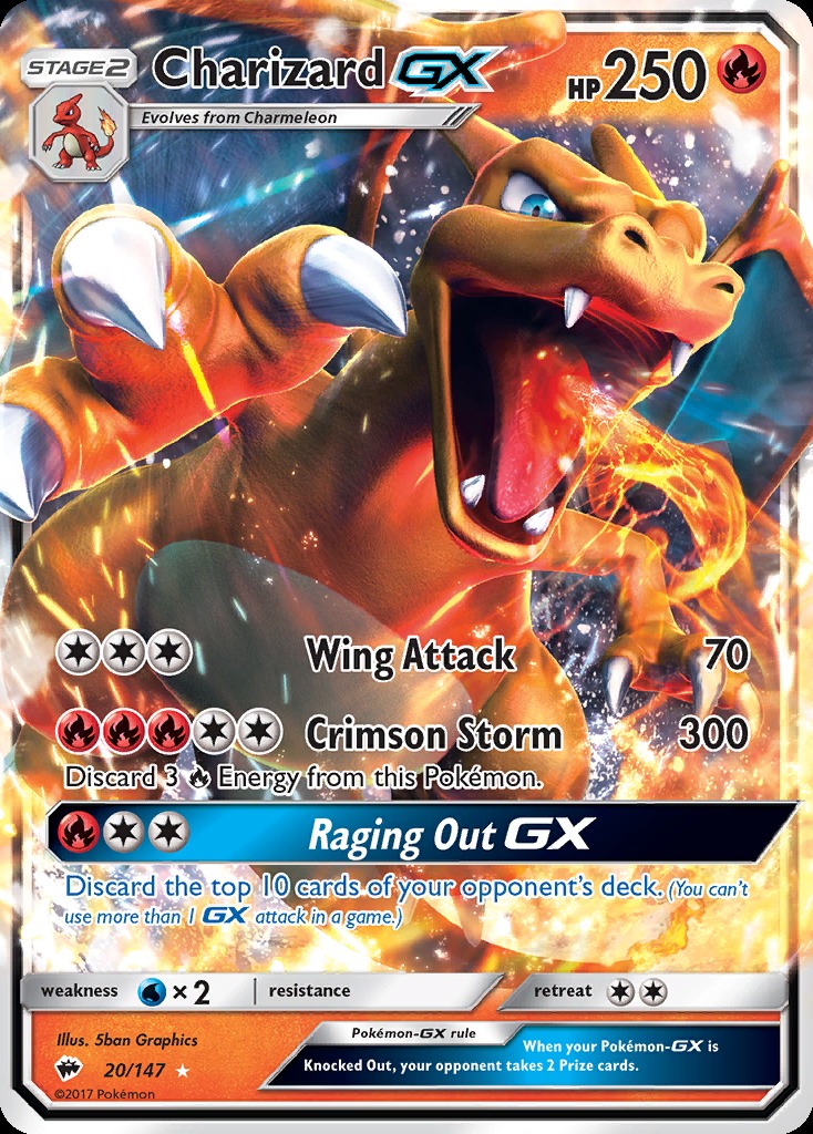
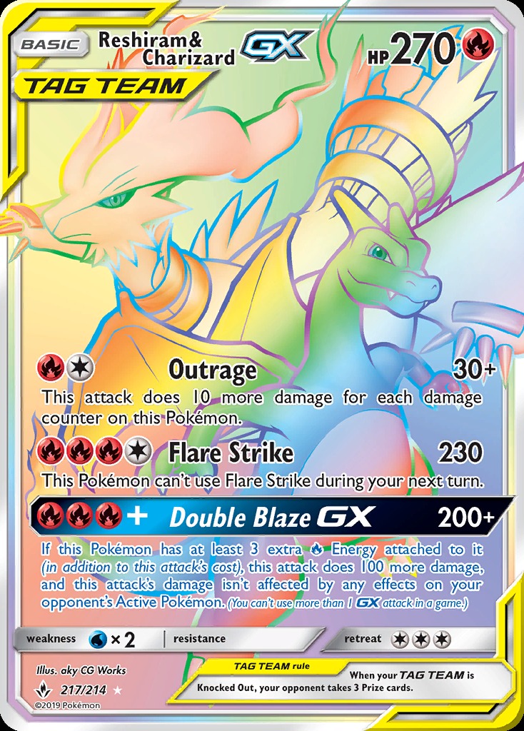
What the cards in this era actually look like
All three carry multiple panels of small type. In each case the text block, not the artwork, is where the surface assessment is decided.
Sources
Sources and further reading
- The Pokémon Company — the Sun & Moon series, 2016 to 2019.
- The Pokémon Company — the GX card class, with a GX attack printed in its own rule bar.
- The Pokémon Company — the Tag Team class, introduced in this era, with two names and a shared HP on one card.
- CardSpicy — PSA vs BGS vs CGC, for how print quality is treated within the surface assessment.
- CardSpicy — The seven types of card damage, for the difference between a print defect and handling wear.
- CardSpicy — Era 9 — Sun & Moon, 2016 to 2019, for the card-level history this page assumes.
Related reading
- Era 9 — Sun & Moon, 2016 to 2019 — GX and Tag Team in full.
- Grading XY era cards — the previous era, where identification came first.
- Grading Sword & Shield era cards — the next era, and the population paradox.
- All twelve Pokémon card eras — the timeline.
- PSA vs BGS vs CGC — how print quality enters the surface subgrade.
- Sealed Sun & Moon product — where the clean raw copies come from.
Nothing on this page is investment advice, and no card or grading service is offered for sale here. Grades are assigned by third-party companies; the descriptions of layout, print behaviour and storage are structural and are not population figures or prices.
Where to go next
- The CardSpicy card index — every card we track, with its PSA 10 population and market history (195 cards).
- The illustrator index — every artist behind those cards, card by card (110 artists).
Leave a Reply